Enhancing User Experience with Responsive Design in Web Development Solutions
In the constantly changing world of digital technology, prioritizing user experience (UX) in web development is crucial. A key component of an exceptional UX is responsive design. But what exactly is responsive design, and why is it so crucial in web development solutions? This article aims to shed light on how responsive design improves user experience, guiding you through its benefits and why it should be a fundamental component of your web development strategy.
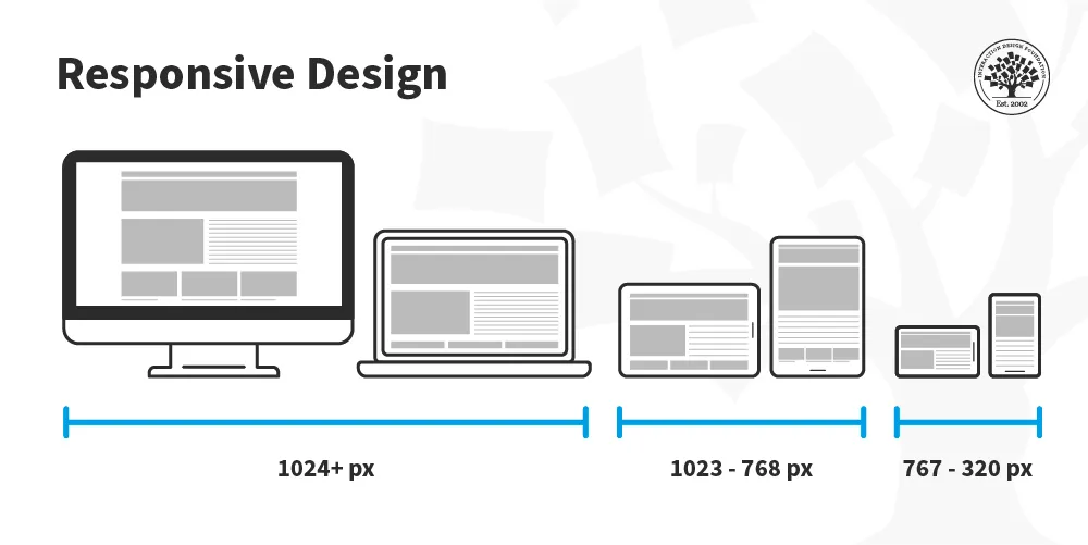
What is Responsive Design?
Responsive design is an approach to web design that ensures a website looks and functions well on a variety of devices and screen sizes, from desktops to smartphones. This includes using adjustable CSS layouts, images, and media queries to adjust the look and functionality of the website based on the user’s device. This guarantees a smooth and excellent user experience, no matter how the website is being viewed. Essentially, responsive design creates a flexible and fluid web layout that adjusts to the user’s device.
Why is Responsive Design Essential in Web Development Solutions?
- Enhanced User Experience:
- The main objective of every web development solution is to design a website that is user-friendly and enjoyable to navigate. Responsive design directly contributes to this by ensuring that your site looks and functions well on all devices. A site that is difficult to navigate or read on a mobile device can frustrate users, leading to higher bounce rates and lower engagement. In contrast, a responsive design enhances user satisfaction and retention by providing a consistent and smooth experience.
- Improved SEO:
- Google prioritizes mobile-friendly websites in its ranking algorithm. If your website has a responsive design, it is considered mobile-friendly, which can enhance its search engine rankings. Higher rankings result means more people seeing your website, which brings more visitors and ultimately boosts the conversion rates. By incorporating responsive design into your web development solutions, you align with SEO best practices and improve your chances of being found by potential users.
- Cost Efficiency:
- Having different websites for desktop and mobile users can be costly and time-consuming. Responsive design eliminates this need by creating a single website that works across all devices. This not only reduces development and maintenance costs but also ensures a unified branding and user experience across all platforms.
- Future-Proofing:
- With the rapid advancement of technology, new devices with varying screen sizes and resolutions are constantly being introduced. A responsive design ensures your website remains functional and visually appealing on new devices, protecting your investment in the long term. By integrating responsive design into your web development solutions, you future-proof your website against technological changes.
Read also: BibToGo Goethe Institut – UI/UX Development
How Responsive Design Improves User Experience
- Consistency Across Devices:
- Users often switch between devices throughout the day. A responsive design ensures that your website offers a consistent experience, whether accessed on a laptop during the day or a smartphone in the evening. Encouraging users to spend more time on your site and engage with your content is built on trust and familiarity, which comes from consistency.
Source: https://www.interaction-design.org/literature/article/responsive-design-let-the-device-do-the-work
- Faster Loading Times:
- Responsive websites are often optimized for speed. By using flexible images and fluid grids that scale according to the device, responsive sites typically load faster. Faster loading times are crucial for retaining users, as studies show that even a one-second delay in page load time can lead to a significant drop in conversions.
- Accessibility and Usability:
- A responsive design improves accessibility by ensuring that your website is usable by everyone, regardless of their device. This includes features like larger, more readable fonts on small screens, touch-friendly buttons, and intuitive navigation. These elements collectively enhance the overall usability of your site, making it easier for users to find what they need and complete desired actions.
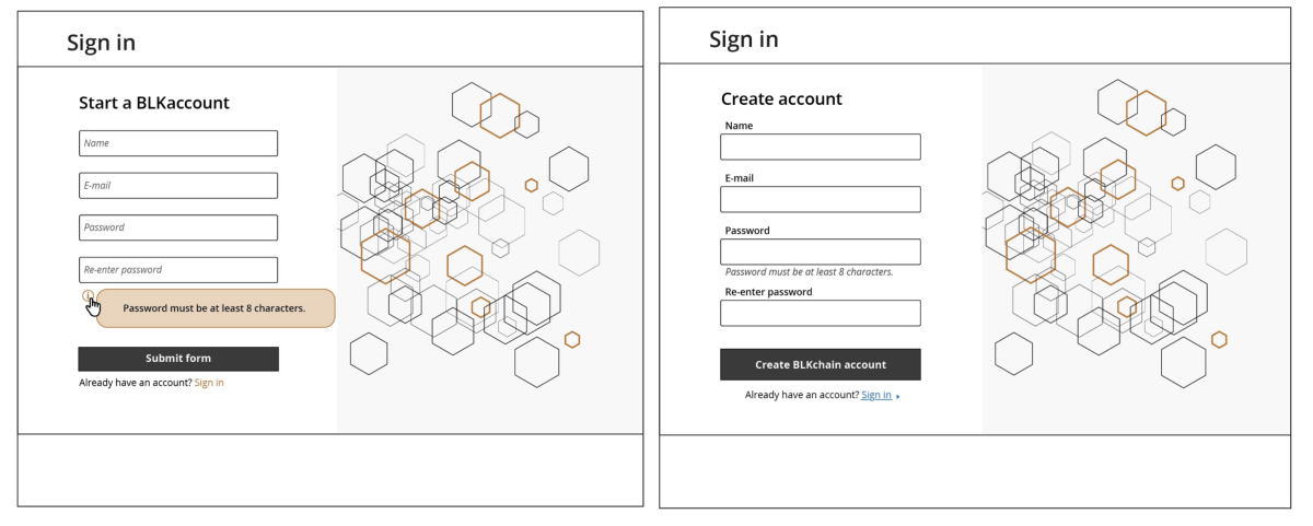
Left: example of form labels inside of form elements; Right: example of form labels outside of form elements
Source: https://www.interaction-design.org/literature/article/responsive-design-let-the-device-do-the-work
Conclusion
In today’s digital age, responsive design is not just an option but a necessity in web development solutions. By enhancing user experience through consistent design, faster loading times, and improved accessibility, responsive design plays a critical role in the success of your website. Whether you are looking to learn about web development solutions, compare different options, or implement a solution for your project, incorporating responsive design will ensure your website meets the needs and expectations of modern users.
Embrace responsive design in your web development strategy to provide a superior user experience and stay ahead in the competitive digital landscape.
References:
https://www.linkedin.com/pulse/navigating-digital-landscape-crucial-role-uxui-design-sibi-ravi-vikhe
https://bootcamp.uxdesign.cc/revisiting-ux-with-google-certificate-the-mobile-first-approach-148c872e3f0c
https://www.slideserve.com/hesten/best-seo-company-in-nagpur